Creating your own CSS file for an iframe
| Background |
|---|
Before starting this tutorial, make sure you understand the following topics from the Quick start section:
|
Nexio provides the option to provide a custom CSS file for an iframe so that you can match your site's style.
This topic provides information about the general CSS structure of the iframe, the default CSS for it, and how you might adapt the CSS to your own site.
After creating your own CSS file, complete the steps in Specifying your own CSS file to force the system to use your CSS with the iframe.
CSS tips
The following tips can help you get the most out of the iframe CSS file:
- It is a good idea to prepend all of the selectors with
#paymentFormand a space so that the style only applies to fields in the iframe form. For example,#paymentForm .label { [CSS_code_here] }(instead of just.label { [CSS_code_here] }). - Not all styles indicated are available with every iframe. See the description for information.
- If no character precedes the selector (such as for
fieldset), it applies to the HTML element by that name. - The
#at the front of a selector indicates anidby the specified name. - The
.at the front of a selector indicates aclassby the specified name. - Separate selectors with a space to indicate selectors that are descendants of the first selector. For example,
div papplies for allPHTML elements within theDIVelement. - When you combine selectors without a space, it indicates that only specific HTML elements should be affected by a
classorid. For example,button#submitButtonapplies only to the HTMLbuttonelement when that element has anidofsubmitButton. - Because of the wide variety of possible selector combinations, we have only included the main ones in the table below. A CSS expert should be able to take the given information to customize the CSS to match your desired style for the form and each form element.
For additional help and tips with CSS, do a search online to get to a website such as https://www.w3schools.com/css/default.asp.
CSS options in the iframe
The following table shows the default CSS for the iframe, information about what it does, what elements are affected, and the default CSS declarations:
| Selector | Details | Location | Default value |
|---|---|---|---|
@media screen and (min-width: 768px) | Specifies any specific styles to apply for a web browser screen when it is at least 768 pixels wide. By default, the width is set to auto-size, display "inline-block", no text wrapping, align all elements to the right and top, include a right margin of 8 pixels, and set top padding at 4 pixels. | Entire web browser screen | { .FormLeftColumn { width: auto; display: inline-block; white-space: nowrap; text-align: right; vertical-align: top; margin-right: 8px; padding-top: 4px; } } |
#loader | Defines the look of the loading animation. By default, this is set to display 5 pixels from the top of the iframe, have a 1 pixel border that is a very light shade of gray around a 12x12 pixel darker gray circle. | Displays in the iframe space before it loads | { position: absolute; top: 5px; border: 1px solid #e1e1e1; border-top: 1px solid #ababab; border-radius: 50%; width: 12px; height: 12px; animation: spin .5s linear infinite; } |
@keyframes spin | Displays a spinning animation to be used while loading the iframe. | Displays in the iframe space before it loads | { 0% { transform: rotate(0deg); } 100% { transform: rotate(360deg); } } |
*:before | Creates a pseudo-element that is the first child of every HTML element. By default, we have only set up to inherit box-sizing. | All HTML elements | { box-sizing: inherit; } |
*:after | Creates a pseudo-element that is the last child of every HTML element. By default, we have only set up to inherit box-sizing. | All HTML elements | { box-sizing: inherit; } |
html | Selects only the HTML ( By default, we've set the font family to be "Montserrat" and then listed a cascading list to use depending on what is available to the web browser. We've also set margin, padding, and borders to 0. And set | HTML element (border-box is the default styling that browsers use for the | { font-family: Montserrat, Arial, Helvetica, sans-serif; margin: 0; padding: 0; border: 0; box-sizing: border-box; } |
body | Defines the body of the document. By default, we've set margin, padding, and borders to 0. And set | BODY element (border-box is the default styling that browsers use for the | { margin: 0; padding: 0; border: 0; box-sizing: border-box; } |
#paymentForm | Any element with an By default, the system is set to have 0 opacity but a transition opacity of 0.2 seconds. Some other CSS you could specify here would be a width for your iframe, margins, or padding. | Entire iframe | { opacity: 0; transition: opacity .2s; } |
.loaded or #paymentForm.loaded | Any element with a For the iframe, this is only the By default, the opacity is set to 1 (anything behind the iframe is not visible at all). | Entire iframe. | { opacity: 1; } |
fieldset or .fieldSet | Either of these selectors can be used to style the same thing since all the By default, there is a 1 pixel border that is light gray. Each block has padding of 10 pixels (the bottom padding is 20) and a bottom margin of 10 pixels. The border corners are rounded. | Card information block, Billing address block | { border: 1px solid #d3d3d3; padding: 10px 10px 20px 10px; margin-bottom: 10px; border-radius: 4px; -moz-border-radius: 4px; -webkit-border-radius: 4px; } |
fieldset:first-child | The pseudo-selector of In the iframe, this is the same as specifying the By default, this selector is not specifically set. You could add a height or other CSS, or instead use the setting for the | For the iframe, it is the legend HTML element that displays the text "Card Information" and also "Billing Information" | |
fieldset legend or legend or .legend | Legend tags within the For the iframe, this is the By default, this selector is not specifically set. You could add padding ( | The legend HTML element that displays the text "Card Information" and also "Billing Information" | |
.fieldSet .formRow or .formRow or div .formRow | All child elements of the By default, this is set to have a 5-pixel margin and to use a relative position. | The formRow class elements include the label, label separator, and the form field with any explanatory and validation text | { margin: 5px; position: relative; } |
.label | Applies to all elements with a By default, this is set to be dark red. | The entire SPAN section for the label and the label separator. | { color: #1f1f1f; } |
.requiredField or .fieldSet .requiredField | Applies to any class of In the iframe, these are the ones that are marked as required and have an asterisk to denote they are required. By default, these are set to be red. | Any field that is required in the iframe, such as the cardholder name, card number, expiration information, and so forth | { color: #ff0000; } |
.field or .fieldSet .field | Specifies any field that has a By default, this is just set to have an extra large top margin. | Any non-required field | { margin: 20px 0 0; } |
.labelSeparator | Selects any element with a For the iframe, this applies to each span around the colon ( : ) that comes after the label and before the form field. By default, nothing is defined for this selector. You could change it to not display the colon, for example ( | Colon ( : ) between the label and form field | |
.grey | Selects any element with a By default, this is set to be light gray and 12 pixel font size. | This is only used in the part of the iframe below the cardholder name field for the "(as it appears on card)" text | { color: #d3d3d3; font-size: 12px; } |
#cardHolderNameValidation#ccNumberValidation#ccCardTypeValidation#expirationValidation#securityCodeValidation#countryValidation#addressValidation#cityValidation#stateValidation#postalValidation | Selects the indicated By default, these are not specifically styled. | Validation text associated with the indicated field. This is often the text "Required" | |
#cardHolderNameSanitation#countrySanitation#addressSanitation#billToAddressTwoSanitation#citySanitation#stateSanitation#postalSanitation | Selects the indicated By default, these are not specifically styled. | Sanitation text, such as what not to put in the field or to select. For example, the "Field cannot contain credit card number" text | |
.fieldSet .formRow .validation or .formRow .validation or .fieldSet .validation or .validation | Use the best selector option for styling the elements you want that have a By default, these are set to not display (until after the form field is filled out or the user attempts to submit the form. The font size is 11 pixels, background color is white, and text color is red, with half opacity. | All validation and sanitation text, such as "Required" and "Field cannot contain credit card number" | { display: none; font-size: 11px; background-color: #ffffff; color: rgba(255, 0, 0, 0.5); } |
.error | Selects all elements with a By default, this is set to add a 1-pixel red border with slightly rounded corners. | Assigned to any form field that the system marks as in error (such as missing value for a required field or incorrect data in a field) | { border: 1px solid #ff0000; border-radius: 2px; } |
.fieldSet.error | Selects any element with a By default, this is set to have a 1-pixel red border. | Assigned to any fieldSet class element that the system marks as in error | { border: 1px solid #ff0000; } |
.fieldSet select.error | Specifies any SELECT element that has an error class within an element with the For the iframe, these are the expiration month, expiration year, country, and state fields. By default, this is set to have a 1-pixel red border. | Applies any time the system marks the SELECT field as being in error | { border: 1px solid #ff0000; } |
.fieldSet .validation.error or .validation.error | Specifies all elements have a By default, this is set to display inline with no border. | Applies any time the system marks the field as being in error | { display: inline-block; border: 0; } |
input | Includes all "input" HTML elements. For the iframe, these are the form fields. By default, the system displays these with the specified width, border, padding, font, and rounding of corners. | Applies to the following form fields: cardholder name, card number, card security code, billing address line 1 and 2, billing address city, billing address for state when it is not a dropdown list, and billing address postal code | { and (to override the previous font setting): |
input:focus | Applies when the user gives focus to the form field. By default, sets the field to not have an outline. | Applies to the following form fields: cardholder name, card number, card security code, billing address line 1 and 2, billing address city, billing address for state when it is not a dropdown list, and billing address postal code | { outline: none !important; } |
input:hover | Applies when the user hovers the mouse cursor over the form field. By default, sets the cursor to change to be able to select text. | Applies to the following form fields: cardholder name, card number, card security code, billing address line 1 and 2, billing address city, billing address for state when it is not a dropdown list, and billing address postal code | { cursor: text; } |
.textBox | Applies to all elements that have the For the iframe, this is the same as using By default, this is not specifically set. | Applies to the following form fields: cardholder name, card number, card security code, billing address line 1 and 2, billing address city, billing address for state when it is not a dropdown list, and billing address postal code | |
.fieldSet .formRow .textBox | Applies to all elements with a For the iframe, this is the same as By default, this is set to have a width of 100%. | Applies to the following form fields: cardholder name, card number, card security code, billing address line 1 and 2, billing address city, billing address for state when it is not a dropdown list, and billing address postal code | { width: 100%; } |
.hidden | Specifies any element with a For the iframe, this is the "state" text field and may also be the "Pay" button. By default, this is set to not display. | Applies to state selection and to the Pay button when it is set to be hidden. It may also apply to any form fields that you specify (in the "Create one-time-use token" request) to hide. | { display: none; } |
.show | The opposite of By default, this is set to display the block. | Applies to any element that may be hidden. | { display: block !important; } |
#cardHolderName or .cardHolderName#ccNumber or .ccNumber#expirationMonth or .expirationMonth#expirationYear or .expirationYear#securityCode or .securityCode#billToCountry or .billToCountry#billToAddressOne or .billToAddressOne#billToAddressTwo or .billToAddressTwo#billToCity or .billToCity#billToStateInput or .billToStateInput#billToStateDropdown or .billToState#billToPostal or .billToPostal | Selects the indicated form field (INPUT or SELECT) by the For the iframe, every form field has an ID and CLASS that you can use to access it. By default, these selectors are not specifically styled. | Applies to each form text field and drop-down field. | |
.dropdown or .fieldSet select.dropDown | Specifies the element with a For the iframe, this includes the expiration month, expiration year, country, and state SELECT elements. By default, the width is set to be 100%. | Applies to the expiration month, expiration year, country, and state drop-down lists | { width: 100%; } |
.fieldSet select or select | Specifies all SELECT elements in the HTML. For the iframe, this is the same as By default, this is set to have 5 pixels of padding and a 1-pixel border that is light gray and has rounded corners. | Applies to the expiration month, expiration year, country, and state drop-down lists | { padding: 5px; border: 1px solid lightgray; border-radius: 2px; } |
.month or .fieldSet select.dropDown.month | Selects the element with the For the iframe, this applies specifically to the expiration month SELECT field. By default, this is set to make the width 10 pixels less than half the page width. | Expiration month drop-down list | { width: calc(50% - 10px); } |
.year or .fieldSet select.dropDown.year | Selects the element with the For the iframe, this applies specifically to the expiration year SELECT field. By default, this is set to make the width 10 pixels less than half the page width. | Expiration year drop-down list | { width: calc(50% - 10px); } |
select:focus | Applies when the SELECT element has focus (when the user clicks to open the drop-down list). For the iframe, this applies to all drop-down lists. By default, this is set to remove the outline of the list. | Applies to the expiration month, expiration year, country, and state drop-down lists | { outline: none; } |
.submitButtonWrapper | Applies when the For the iframe, this is the DIV around the payment button. By default, this selector does not have any specific styling. | DIV around the payment button | |
button | Applies to any HTML element of BUTTON. For the iframe, this is the payment button. By default, the button is styled with some padding, a white background, no background shadow, a small gray border, and rounded corners. | Payment button (text may be "Submit") | { padding: 10px 40px; background: #FFFFFF; -webkit-box-shadow: none; -moz-box-shadow: none; box-shadow: none; border: .5px solid #ccc; border-radius: 3px; } |
#submitButton or button#submitButton | Specifies an element with an For the iframe, this is the same as just By default, the style adds a small left margin and sets the color of the text as dark red. You could customize the CSS to make the button look more like your site's style. For example, have the button display more to the left by setting a negative margin or change the color of the button. | Payment button (text may be "Submit") | { margin-left: 2px; color: #1f1f1f; } |
.disclosures | Applies to the DIV with the For the iframe, this only displays when you use certain connections. By default, the text is styled to be medium gray, centered, 10-pixel font and a white background. | DIV with text of "Processing done in partnership with . . ." | { color: #ababab; font-size: 10px; text-align: center; background-color: #ffffff; } |
.disclosures a | Applies to the A (link) element within the DIV for the disclosure. For the iframe, this only displays when you use certain connections. By default, the text is styled to be medium gray and have no underlining even though it is a link. | The name of the gateway connection at the end of the text of "Processing done in partnership with . . ." | { color: #ababab; text-decoration: none; } |
#threeDSForm | Specifies an element with an For the iframe, this applies for the FORM element when 3D Secure (3DS) is required. By default, this form is hidden. | FORM when 3DS is required | { visibility: hidden; } |
.log | Applies to an element with a For the iframe, this only applies to a DIV when the iframe is loading. By default, this is set to display in a specific position on the page. | DIV with loading or error messages that display before iframe loads | { position: absolute; top: 0; left: 15px; } |
#logMsg | Specifies an element with an For the iframe, this only applies to a SPAN with text that only displays while the iframe is loading. By default, this is styled to be the entire page width, not to wrap the text, 12-pixel font size, and a color of light gray. | SPAN with text that displays before the iframe loads. It includes the text of "Establishing secure connection to payment engine." | { width: 100%; white-space: nowrap; overflow: hidden; text-overflow: ellipsis; font-size: 12px; color: #d3d3d3; } |
#errorMsg | Specifies an element with an For the iframe, this only applies to a SPAN with text that only displays while the iframe is loading. By default, this is styled to be the entire page width, not to wrap the text, 12-pixel font size, and a color of red that is half opaque, but does not display by default. | SPAN with text that displays when there is an error loading the iframe. It includes the text of "Failed to connect to secure server. Please check your internet connection." | { width: 100%; white-space: nowrap; overflow: hidden; text-overflow: ellipsis; font-size: 12px; color: rgba(255, 0, 0, 0.5); display: none; } |
HTML and CSS for Save card iframe
The general form of the iframe is as follows:
<form id="paymentForm" class="loaded">
<fieldset class="fieldSet">
<legend class="legend ">Card Information</legend>
<div class="formRow">
<span class="label">
<span class="requiredField">*</span>Name
<span class="labelSeparator">:</span>
<span class="grey">(as it appears on card)</span>
</span>
<span id="cardHolderNameValidation" class="validation">Required</span>
<span id="cardHolderNameSanitation" class="validation">Field cannot contain credit card number</span>
<input class="textBox" id="cardHolderName" name="cardHolderName" type="text" value="Default Test">
</div>
<div class="formRow">
<span class="label">
<span class="requiredField">*</span>Card Number
<span class="labelSeparator">:</span>
</span>
<span id="ccNumberValidation" class="validation">Card number is invalid</span>
<span id="ccCardTypeValidation" class="validation">We only accept Visa, MC, JCB, Discover, or Amex</span>
<input class="textBox" id="ccNumber" name="ccNumber" type="tel">
</div>
<div class="formRow">
<span class="label">
<span class="requiredField">*</span>Expiration Date
<span class="labelSeparator">:</span>
</span>
<span id="expirationValidation" class="validation">Select a date in the future</span>
<br>
<select class="dropDown month" id="expirationMonth" name="expirationMonth" required="true" title="">
<option value="1">Jan-01</option>
<option value="2">Feb-02</option>
<option value="3">Mar-03</option>
<option value="4">Apr-04</option>
<option value="5">May-05</option>
<option value="6">Jun-06</option>
<option value="7">Jul-07</option>
<option value="8">Aug-08</option>
<option value="9">Sep-09</option>
<option value="10">Oct-10</option>
<option value="11">Nov-11</option>
<option value="12">Dec-12</option>
</select> /
<select class="year dropDown" id="expirationYear" name="expirationYear" required="true" title="">
<option selected="" value="2022">2022</option>
<option value="2023">2023</option>
<option value="2024">2024</option>
<option value="2025">2025</option>
<option value="2026">2026</option>
<option value="2027">2027</option>
<option value="2028">2028</option>
<option value="2029">2029</option>
<option value="2030">2030</option>
<option value="2031">2031</option>
<option value="2032">2032</option>
<option value="2033">2033</option>
<option value="2034">2034</option>
<option value="2035">2035</option>
<option value="2036">2036</option>
<option value="2037">2037</option>
<option value="2038">2038</option>
<option value="2039">2039</option>
<option value="2040">2040</option>
<option value="2041">2041</option>
<option value="2042">2042</option>
</select>
</div>
<div class="formRow">
<span class="label">
<span class="requiredField">*</span>Security Code
<span class="labelSeparator">:</span>
</span>
<span id="securityCodeValidation" class="validation">Security code is invalid, must be 3-4 digits</span>
<input class="textBox" id="securityCode" name="securityCode" type="text">
</div>
</fieldset>
<fieldset class="fieldSet">
<legend class="">Billing Information</legend>
<div class="formRow">
<span class="label">
<span class="requiredField">*</span>Country<span class="labelSeparator">:</span>
</span>
<select class="dropDown" id="billToCountry" name="billToCountry">
<option value="CA">Canada</option><option value="MX">Mexico</option><option value="GB">United Kingdom</option><option selected="selected" value="US">United States</option>
</select>
<span id="countryValidation" class="validation">Required</span>
<span id="countrySanitation" class="validation">Field cannot contain credit card number</span>
</div>
<div class="formRow">
<span class="label">
<span class="requiredField">*</span>Address 1<span class="labelSeparator">:</span>
</span>
<span id="addressValidation" class="validation">Required</span>
<span id="addressSanitation" class="validation">Field cannot contain credit card number</span>
<input class="textBox" id="billToAddressOne" name="billToAddressOne" type="text" value="123 Test St">
</div>
<div class="formRow">
<span class="label">
<span class="field">Address 2<span class="labelSeparator">:</span></span>
</span>
<span id="billToAddressTwoSanitation" class="validation">Field cannot contain credit card number</span>
<input class="textBox" id="billToAddressTwo" name="billToAddressTwo" type="text" value="Suite 123">
</div>
<div class="formRow">
<span class="label">
<span class="requiredField">*</span>City<span class="labelSeparator">:</span>
</span>
<span id="cityValidation" class="validation">Required</span>
<span id="citySanitation" class="validation">Field cannot contain credit card number</span>
<input class="textBox" id="billToCity" name="billToCity" title="" type="text" value="Testerville">
</div>
<div class="formRow">
<span class="label">
<span class="requiredField">*</span>State / Province<span class="labelSeparator">:</span>
</span>
<span id="stateValidation" class="validation">Required</span>
<span id="stateSanitation" class="validation">Field cannot contain credit card number</span>
<input class="textBox hidden" id="billToStateInput" name="billToStateInput" title="" type="text" value="UT">
<select id="billToStateDropdown" name="billToState" class="dropDown">
<option value="AK">AK - Alaska</option><option value="AL">AL - Alabama</option><option value="AR">AR - Arkansas</option><option value="AZ">AZ - Arizona</option><option value="CA">CA - California</option><option value="CO">CO - Colorado</option><option value="CT">CT - Connecticut</option><option value="DC">DC - District of Columbia</option><option value="DE">DE - Delaware</option><option value="FL">FL - Florida</option><option value="GA">GA - Georgia</option><option value="GU">GU - Guam</option><option value="HI">HI - Hawaii</option><option value="IA">IA - Iowa</option><option value="ID">ID - Idaho</option><option value="IL">IL - Illinois</option><option value="IN">IN - Indiana</option><option value="KS">KS - Kansas</option><option value="KY">KY - Kentucky</option><option value="LA">LA - Louisiana</option><option value="MA">MA - Massachusetts</option><option value="MD">MD - Maryland</option><option value="ME">ME - Maine</option><option value="MI">MI - Michigan</option><option value="MN">MN - Minnesota</option><option value="MO">MO - Missouri</option><option value="MS">MS - Mississippi</option><option value="MT">MT - Montana</option><option value="NC">NC - North Carolina</option><option value="ND">ND - North Dakota</option><option value="NE">NE - Nebraska</option><option value="NH">NH - New Hampshire</option><option value="NJ">NJ - New Jersey</option><option value="NM">NM - New Mexico</option><option value="NV">NV - Nevada</option><option value="NY">NY - New York</option><option value="OH">OH - Ohio</option><option value="OK">OK - Oklahoma</option><option value="OR">OR - Oregon</option><option value="PA">PA - Pennsylvania</option><option value="PR">PR - Puerto Rico</option><option value="RI">RI - Rhode Island</option><option value="SC">SC - South Carolina</option><option value="SD">SD - South Dakota</option><option value="TN">TN - Tennessee</option><option value="TX">TX - Texas</option><option selected="selected" value="UT">UT - Utah</option><option value="VA">VA - Virginia</option><option value="VT">VT - Vermont</option><option value="WA">WA - Washington</option><option value="WI">WI - Wisconsin</option><option value="WV">WV - West Virginia</option><option value="WY">WY - Wyoming</option><option value="AS">AS - American Samoa</option><option value="VI">VI - Virgin Islands</option><option value="AA">AA - Armed Forces Americas</option><option value="AE">AE - Armed Forces Europe</option><option value="AP">AP - Armed Forces Pacific</option>
</select>
</div>
<div class="formRow">
<span class="label">
<span class="requiredField">*</span>Postal Code<span class="labelSeparator">:</span>
<span id="postalValidation" class="validation">Required</span>
<span id="postalSanitation" class="validation">Field cannot contain credit card number</span>
</span>
<input class="textBox" maxlength="10" id="billToPostal" name="billToPostal" type="text" value="12345">
</div>
</fieldset>
<div class="submitButtonWrapper">
<button id="submitButton" class="hidden" type="submit" disabled="">Submit</button>
</div>
</form>With the default CSS, it creates a form that looks like the following:
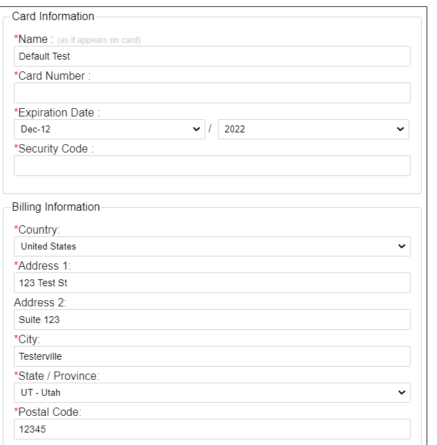
Iframe with default CSS
Examples of CSS files
For example, you could have the following for a CSS file:
.formRow {
    display: flex;
    align-items: center;
    margin-bottom: 14px !important;
}

.label {
    margin-right: 3px;
    text-align: right;
    width: 180px;
    color: #1f1f1f;
}

.validation {
    font-size: 10px !important;
    top: -13px;
    right: 2px;
    position: absolute;
}

.grey {
    display: none;
}

.fieldSet select.dropDown.month, .fieldSet select.dropDown.year {
    width: calc(50% - 17px);
}
The main changes made in this file are adding bigger margins between form rows, aligning the labels to the right in a column, and putting the label to the left of the form field.
The above CSS file makes an iframe that looks like the following:
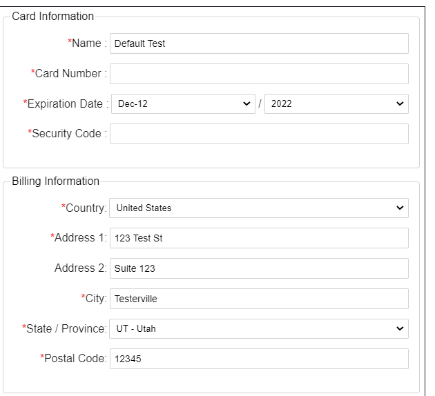
Iframe with basic CSS
Or you could have the following for a CSS file:
#paymentForm {
    width: 480px;
    padding: 20px 10px;
}

#paymentForm fieldset {
    border: 0;
    padding-left: 5px;
}

#paymentForm fieldset:first-child {
    height: 175px;
}

#paymentForm fieldset legend {
    padding-left: 5px;
    font-weight: bold;
}

#paymentForm .requiredField {
    display: none;
}

#paymentForm .labelSeparator {
    display: none;
}

#paymentForm .label {
    font-size: 70%;
    vertical-align: super;
    font-weight: bold;
}

#paymentForm .grey {
    font-size: 85%;
}

#paymentForm .fieldSet .formRow {
    margin-bottom: 15px;
}

#paymentForm .fieldSet .validation.error {
    display: none;
}

#paymentForm fieldSet:first-child .formRow:nth-child(3) {
    position: absolute;
    top: 115px;
    left: 17px;
    width: 200px;
}

#paymentForm fieldSet:first-child .formRow:nth-child(4) {
    position: absolute;
    top: 115px;
    left: 217px;
    width: 200px;
}

#paymentForm fieldSet:first-child .formRow:nth-child(4) select {
    height: 30px;
}

#paymentForm fieldSet:first-child .formRow:nth-child(4) select:nth-child(4) {
    position: absolute;
    left:0;
    width:80px;

}

#paymentForm fieldSet:first-child .formRow:nth-child(4) select:nth-child(5) {
    position: absolute;
    left:80px;
    width:65px;
}

#paymentForm fieldSet:first-child .formRow:nth-child(5) {
    position: absolute;
    top: 115px;
    left: 362px;
    width: 85px;
}

#paymentForm #submitButton {
    margin: -25px 12px;
}
The main changes made in this file are adding space between form rows, bolding legend text, removing the label separator colon ( : ),making the card information fit in a smaller space, and making the grey element display in a smaller font.
The above CSS file makes an iframe that looks like the following:
Iframe with complex CSS
Updated 10 months ago